I'm glad I didn't pay money for that.
|
In a world of widescreen monitors that are most often showing text--just look at the big gray areas on TSL at left and right--if you are going to choose one location, why on earth would you make a choice that wastes vertical real estate? Why on earth would you put something that is most often not the focus front and center?
UX at Micro$oft stands for User eXploitation. (yeah, dramatic, but it fits the acronym)
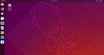
I'm pretty fond of the gnome/ubuntu design. Icons at left for common programs. Some information across the top, but the title bar of a maximized program is merged into it to save space.
[Post edited by jmanatVT at 04/12/2022 1:43PM]
|
(
In response to this post by EDGEMAN)
Posted: 04/12/2022 at 1:40PM


 I'm glad I didn't pay money for that. -- jmanatVT 04/12/2022 1:40PM