
The latest infographics, including a statistical comparison between Tech and UVa (they’re close!), and a look at Tech’s results after a bye week dating back to the 2000 season.
To see all of OXVT’s infographics, follow him on Twitter at @OX_VT. Follow TSL on Twitter at @TechSideline.
Great work by OXVT as always, and be sure to tweet your infographic requests to him on Twitter @OX_VT, or post them to our message boards.
CLICK EACH OF THE FOLLOWING INFOGRAPHICS TO SEE A LARGER, FULL-SIZED VERSION.
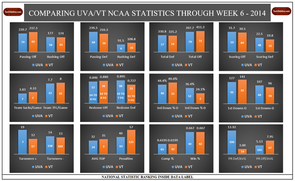
First, a look at how VT and UVa compare after the first six weeks of the college football season. They’re eerily close in a lot of stats.
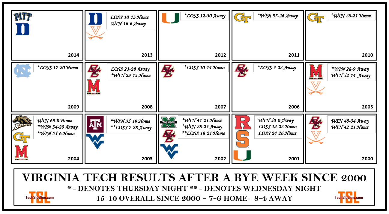
Next up is a look at how the Hokies have done in games after bye weeks, dating back to the 2000 season. It’s not very good, considering Tech’s overall record (136-49) during that same time frame of 2000-2013.
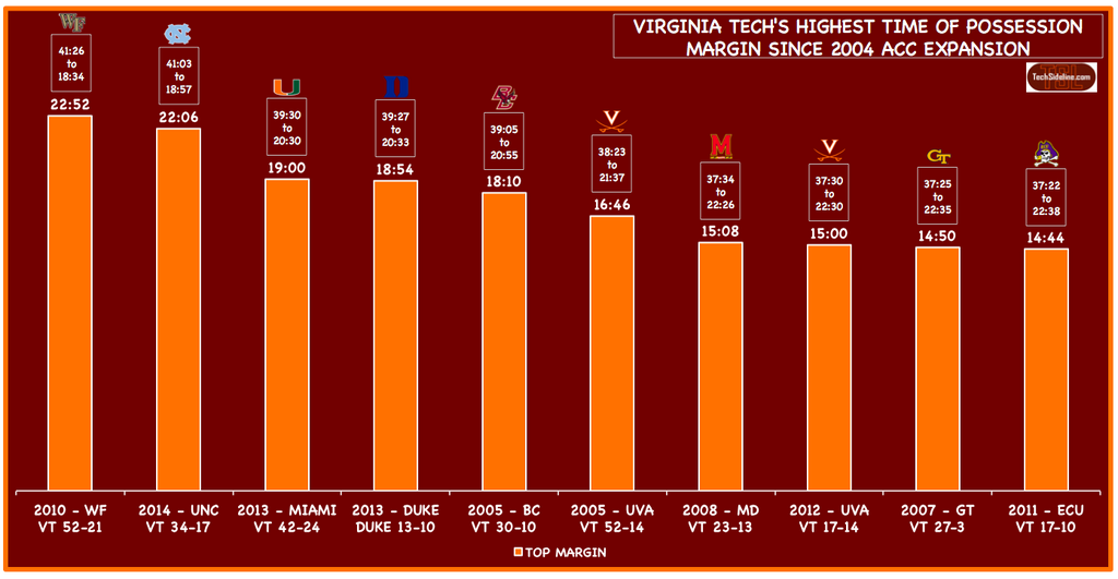
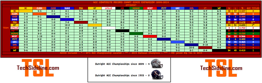
The Hokies recorded their second-best ever Time of Possession (TOP) stat under Frank Beamer (dating back to 1987) when they held the ball for 41:03 against UNC last weekend. Here’s a look at Tech’s top-ten TOPs since ACC expansion (we HATE the Duke 2013 stat).
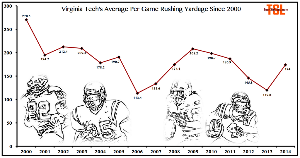
The Hokies aren’t having a great year running the football, but it’s not their worst … here’s a look at yards-per-game rushing since the 2000 season.
Speaking of running the football, here’s a game-by-game breakdown of the tailbacks in 2014.
![]()
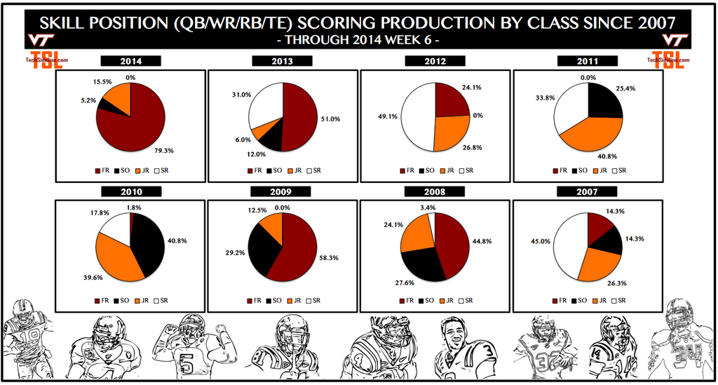
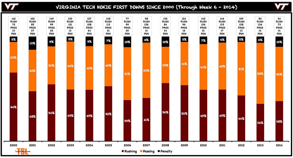
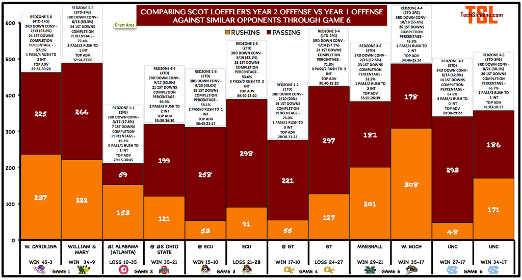
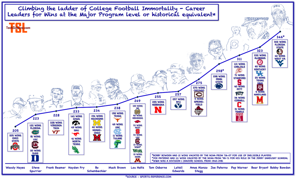
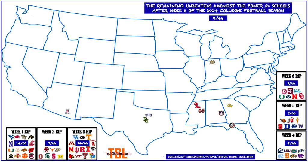
Lastly, the latest updated infographics that OXVT does on a week-by-week basis:


Many thanks to the hardest-working horned creature in Hokie football … OXVT!
 Print
Print


Something I always felt should be followed in College football is the athlete development.
A comparison of different recruiting class rankings (maybe according to rivals100 or espn300) vs the actual records obtained by those classes in their college days. Another interesting comparison would be between the number of 4 and 5 star recruits vs the number of players drafted. I think both of these stats would tell you a lot about the coaching staff ability to use the talent they have and to develop the athletes they get.
@OXVT: I think it’d be interesting for you to take your last infographic, change the color spots for same team rows/cols to black (instead of team color), and then assign a “heat” color to each matchup based on the horizontal teams winning percentage. That way it’d be easier to see who each team is owning and who they are getting owned by.
Thanks for all of the other interesting infographics you do!
Interesting! 🙂
Ask and you shall receive …
http://www.brinkleys.org/users/tsl/Files/Screen%20Shot%202014-10-09%20at%2012.46.38%20PM.png