
Every year, Randy Jones produces a detailed report and analysis of Virginia Tech Athletics finances for TechSideline.com, with data culled from published NCAA reports on the Virginia Auditor of Public Accounts (APA) web site.
We just ran the tenth installment of Randy’s report, meaning that we now have a decade’s worth of data on VT athletic finances (more, actually; Randy’s original 2004-05 report included data going back to 1999-2000).
Here’s a link to all of Randy’s reports, which we run as TSL Pass subscriber features:
VT Athletics Financial Reports
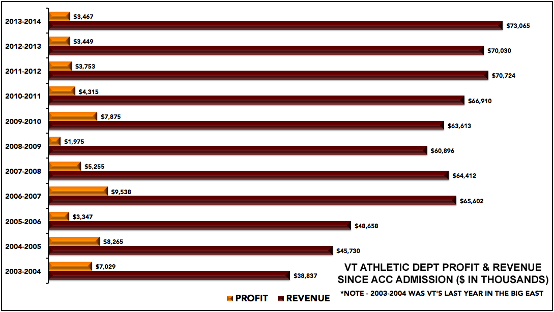
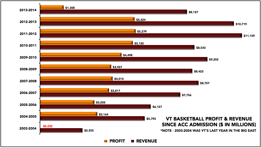
The reports are awesome and full of detail, and this year, we enlisted TSL infographics guru OXVT (follow him on Twitter, if you haven’t heard us say that before) to produce a few simple charts to include in the report.
OX’s charts show revenues and profits (as reported by Virginia Tech) for the last eleven years, dating back to VT’s final year in the Big East, for the athletic department as a whole, and for football and men’s basketball.
As always … click for a larger version.

 Print
Print


Do you have any high level insight on some of the things we see in the charts? Why did bball profit drop so much this year (paying 3 coaches)? Why did football profit jump this past year? I would have expected the opposite with not selling out Lane any more. Why was overall profit much higher in 06 and 09?
Jump in profit for football last year is likely due to the larger payout from the Football playoff and the fact that the ACC had two teams in the “BCS” bowls.
Nice work OX, looks like bball was trending up with Greenberg, I would imagine we’d see a spike over the next 3-4 years between buzz and whit. Thanks again for your work
Not to nit-pick, and someone check me on this, but $73,065 (in millions) would actually be over $73 billion – wouldn’t it? I mean, we all know what the numbers mean, but I think the graphic should read ($ in thousands) or the number should be $73.065 ($ in millions).
Otherwise, I love the information. I just wish the orange lines were getting bigger along with the maroon ones.
Years of mismanagement by Weaver and Beamer are why the lines aren’t as you wish… But with Whit in charge, we will get there!
really ? good grief !
That’s not nit-picking … that’s an excellent point, missed by OXVT and his editor. 🙂
To be fair that’s what it says on the financial data chart in the articles as well 🙂
Thx. I thought the same
Go hokies