

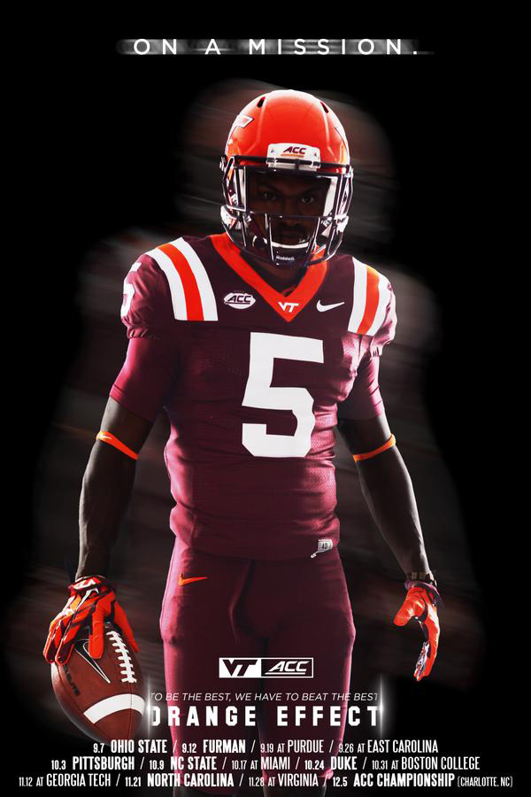
Yesterday we asked you what you thought of Tech’s new helmets, and 73% of voters said they liked them. Today the Hokies released their entire uniform combination for the Ohio State game…
What do you think?
Do you like Virginia Tech's uniform combination for the Ohio State game?
- Yes (81%, 3,134 Votes)
- No (15%, 582 Votes)
- I don't know/undecided (4%, 173 Votes)
Total Voters: 3,889
 Print
Print


I remember, several years ago, watching Von Hebron race into the end zone at Lane, during win vs. UVa, in all maroon. Loved that combo since.
I didn’t think I’d like the helmet, but with the all maroon with orange shoulder stripes, it’s a great look. Plus it is not the forbidden all orange uni that we all hate.
Thank goodness no orange jerseys or pants. That combo should be permanently banned. I like the OSU combo.
Eliminate the shoulder stripes OR the orange trim on the collar and it is a great uniform. The collar trim and the shoulder stripes together are way too much. It’s a darn shame somebody involved in the decision couldn’t figure that out. Jeez. No worries though… this team will lay it all on the line Monday night and make us proud regardless of the final outcome. Go Hokies!
Probably looking for “flare” and ended up over-doing it. But in marketing, which unis are sort of a form of, you’re never going to please everyone. I whole-heartedly second McHokie78’s comments. I don’t think I’ll ever get over how silly I think we look in all-white or all-orange. All-maroon, however, we look mean. And come Monday, we need need to be well past mean!!
All-Maroon has won more games. How can one argue against that??!?
I’m OK with all white, but all maroon is by far my favorite. All orange = donkey. I would love to see the “retro stripes” just go away, but I don’t see it happening.
The helmets are orange. Also, have special uniforms won more games?
I like the shoulder strips. It is starting to be associated with VT. “There is no explaining teste”.
I really, really, really, like the shoulder stripes on this combo. Really makes the orange stand out. Without the shoulder stripes it would be boring. The stripes make the players look like they are playing football not soccer. Love the term Techaholic in the comments section more than the uniform. LOL
I believe the boys from VPI will win yet again!
GO HOKIES! BEAT ohio !
I would love to have the uniform picture in poster form for my Hokie room. Is it for sale?
Really thankful they were not all orange.
There’s that…
Elite programs are not changing their uniforms constantly.
BS! Look at Oregon.
Oregon is a joke.
Or I should have said…their uniforms are a joke. Good FB team.
Voted yes, but maroon jersey, white pants & maroon helmet my favorite. As long as win, they could wear pink helmets & jerseys & yellow pants. Be interesting to see how they look at game time.
White pants, maroon jerseys with stripes, and maroon helmets. But if 19 year olds want to change it up, whatever.
Glad to see VT put style in unis. About time! Love the helmets.
Thank you! hell its not about us it’s the recruits and players that matter most! We are probably well past our playing days and it’s time we please the future recruits and players and stop whining about a uni as if that really means anything to the outcome of games! I’ve never understood this argument because for normal game we wear the traditional unis most of the time and it’s not like they permanently changed anything! Good grief please get over this!
I LOVE the shoulder stripes. Surprised with the negative reaction to them. Great looking uni.
Its going to be ridiculously confusing if everyone is wearing number five.
Good point! That’s a great point! You are a fellow I could drink with, Techaholic! Yes!
Probably more important what the 15 – 18 year old recruits think is cool rather than what we think is fashionable. For that group, over the shoulder stripes probably aren’t retro
All but the shoulder stripes. They were fine for awhile but CFB has got to give up on those. Change happens slowly in Blacksburg as I recall. Like the shiny helmets but they are also very 2013. We are a bit late to the party on that one IMO.
Ditto. I voted “like”, but it would go to love if it was no shoulder stripe. Not sure why, but I just don’t like that look.
Yep, time we moved on from them. Many of us don’t even know they are ‘retro’. Just…stripes.
Agreed – the Ole Miss look should have been a one-game throwback, not the permanent jersey. Most of the jerseys from 2004 to 2010 were good. I get that we needed to pick one, but not this one from Beamer’s playing days.
Love the look, it’s striking. However if we can play close to potential, I don’t care if we wear pink tutus with yellow propeller caps!
We get your point but you really don’t mean that last part. Something tells me you would draw the line way before pink tutus and yellow propeller caps. TIC
So interesting that so many comments bemoan the shoulder stripes (and I agree – “Lupus, er, throwback jersey, you devil, begone”! ) and yet the voting tallies are overwhelmingly positive.
I thought the voting was about the metallic orange helmet with maroon jersey / pants (as did most everyone else). 1 person said they liked the stripes. Most said they didn’t.
Just get ride of the shoulder stripes and this uniform rocks. Love the helmet. Great looking combination with white jersey and maroon pants
The helmet color is in honor of the Orange bowl, where we will be playing on 12/31/15.
I’d prefer maroon helmets with that look even if it was a matte maroon or something to the effect. I do agree with the comments that with this particular combination, losing the shoulder stripes would clean up the look. I typically like the stripes but this combo would be better without them.
Does the 5 mean Tyrod or Marcus will be playing???
Al Clark.
Looks like I’m in the minority, but I HATE the shoulder stripes on any of our uniforms. They look straight out of the leather helmet era.
You’re not alone. I’m over the shoulder stripes. Otherwise, I really like these unis.
you’re not alone. I had to vote ‘no’ on this poll because of them
Agreed
Yep agreed. #StripesOut
Why not invert the helmet VT from orange to maroon since the helmet is inverted maroon to orange? Just curious…
The sticker is actually “clear” so the orange is showing thru (at least for the “VT”). I’m not sure they have actual stickers that are orange or maroon.
They could have and should have gone with regular size maroon VT decals.
Love the uni’s. Shoulder stripes are great. I am traditional and would like to see same stuff all the time. I don’t think what the uniform means anything as to the outcome of the game. It’s what’s inside that counts!!!!!!!!!!
It’s interesting how fashion and design has generally trended to be more moderated, subdued, minimalist…while football uniforms seemingly get louder and louder.
Perhaps not “interesting”…but I noticed it. So I posted it.
I thought the look was pretty $ (stripes and all) until the helmet. Alas.
Yes, I like it! I was afraid they would come out in full orange.
When did the circus come to town?? I didn’t see no trucks!
I just like our maroon helmets – always. And my preference for burnt orange as opposed to this blaze orange endures…maybe we can win a deer hunting national championship to go with the bass fishing title.
you da man, NC
I think it looks great. I do agree with some that the shoulder stripes don’t work as well with an orange helmet, BUT the all maroon is awesome.
People would be complaining a whole lot more if they had an orange jersey and/or pants.
Why is it called “orange effect” when only the helmet is orange? It’s more like “orange highlights”. But if we beat OSU, I won’t care if they wore Ron Weasley’s dress robes.
Orange effect is for the crowd, not the players.
Like several of the others, I think the shoulder stripes have just got to go. Everything else about this uniform is great, though.
I think it stinks! We always play badly in solid maroon. I like contrasting pants and jersey. We need one uniform that is identified with VT. Not a bunch of different ones with no identity.
I think the article done by TKP last year showed that all maroon was actually one of the most successful uniform combinations from a W-L perspective.
Here’s the link in case you were interested.
http://www.thekeyplay.com/content/2014/august/5/gobblermetrics-allmarooneverything
12-7 is the record but they have won 5 in a row in the combination.
Completely backwards. Orange is the color that resulted in more losses.
The throwback uniforms were nice for a while but need to be replaced ASAP.
Its awesome. The only thing I would change is the stripes on the shoulders. I would have just gone will a solid maroon look and the orange trim
Nope gotta love the shoulder strips as that is what J T Barret will see coming into his chest as he fumbles the ball because of the hit.
GO HOKIES!!!
No. The Helmet is great, but the whole thing looks like a mess with the terrible shoulder stripe jerseys.
I generally like the shoulder stripes, but I think this particular uniform would be better without them. I guess my feeling on that is based on the premise that the shoulder stripes are a “vintage” look, while this uniform is a “modern” look. Still, it’s good on the whole.
nailed it
EXACTLY what I said before. Solid Maroon jersey / maroon helmet sticker.
The true colors of VT…Love the combo
Agree I like the all maroon uni, the orange helmet is a nice contrast. I think it would even be good with the maroon pants, white jersey and the orange helmet.
GO HOKIES BEAT osu!!!