

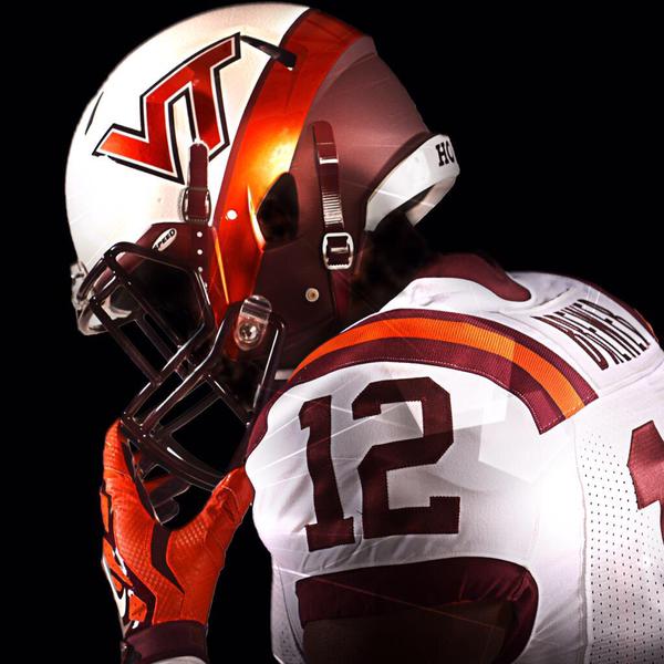
Over the weekend, the @VTFBEquipment Twitter feed was teasing a cool new helmet and uniform design, and finally, on Sunday afternoon they revealed that the uniform will be worn on September 12th, against Furman as the White Effect / Military Appreciation uniform.
Here’s a look at the full uniform, or at least, as much of it as they revealed. To view larger pics, just click the part of the tweet that you want to see in more detail.
— VT Equipment (@VTEquipment) April 26, 2015
We have been very critical here at TSL of some of the uniform designs of the recent past, mostly the Orange Effect uniforms and the hideous White Effect helmets of 2012.
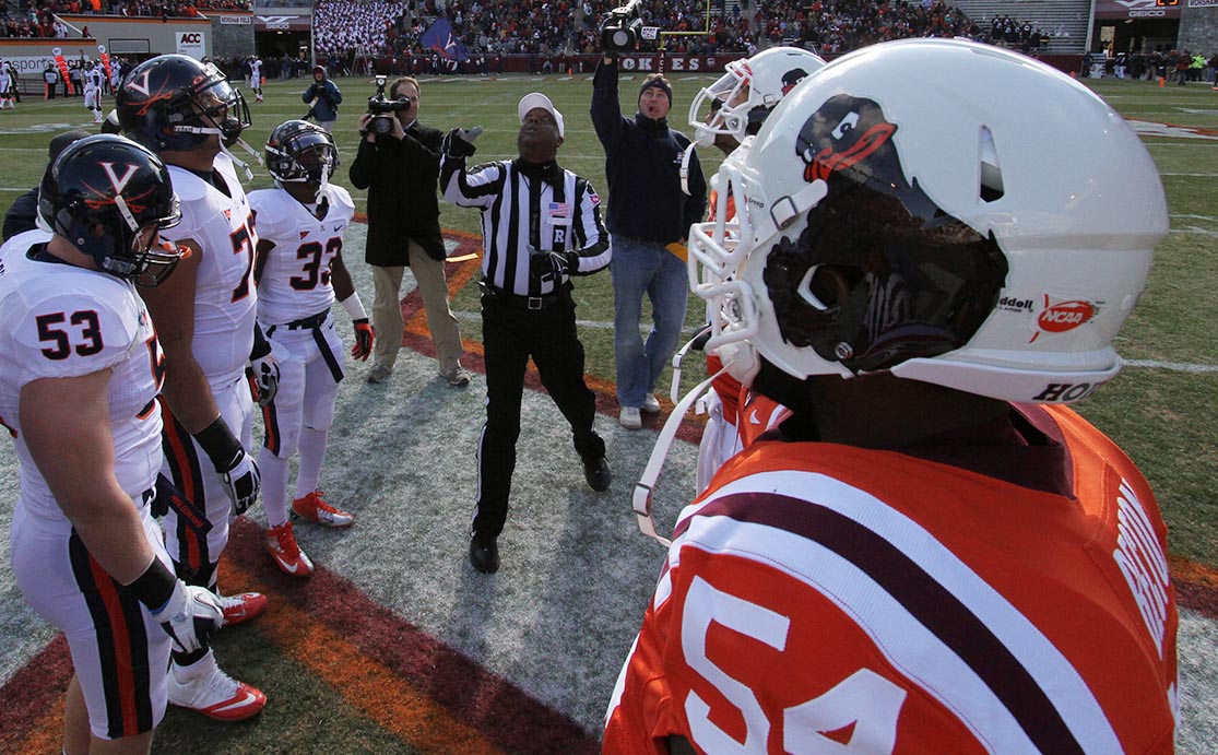
Surely, you remember the 2012 disasters? The turkey tracks helmet from the Austin Peay game:

And the Hokie bird helmet from the UVa game:
But the 2015 Furman design above is very, very cool. Yes, that’s TechSideline.com’s official editorial stance on the subject.
We also like that the pants appear to be maroon … but we wonder how the Hokies will work in Military Appreciation, because that’s not clear from the photos. Last year, they wore regular uniforms with Military Appreciation helmets against ECU, which really wasn’t a bad look. (The uniforms were fine; the team performance was not.)
But enough about what we think. What do you think of the 2015 White Effect/Military Appreciation helmets? Note that the poll is about the helmet only — since that’s the major part of the design — not the overall uniform.
What do you think of the 2015 Virginia Tech White Effect helmet?
- Love it (62%, 1,432 Votes)
- Like it (30%, 688 Votes)
- Dislike it (3%, 76 Votes)
- Other/not sure (3%, 67 Votes)
- Hate it (2%, 36 Votes)
Total Voters: 2,299
 Print
Print


Better than some recent unis. Just win baby! They will come and wear whatever you have. VT logo should be maroon. The maroon is so much prettier and neat than orange, but what do I know.
Totally too many stripes if VT is wearing the white throwbacks with the strips. They detract from the helmet. VT needs to trash the throwbacks and get some better up-to-date designs that will appeal to kids. See Oregon- I think some of their uniforms are really sweet. By the way, I like this helmet. Good design!
you cam call it old fashion but I still love the all burgundy helnet
Don’t know who was in charge of the VT brand back then, but the turkey tracks and the DISASTROUS Hokie bird helmets were epic fails.
Still incredibly bummed about Bill Roth leaving. To a team that spanked us badly in a bowl game nonetheless. Pour some salt on that old wound why don’t ya?
But THIS made my day a bit brighter. Really looking forward to seeing the team decked out in these helmets. And I’m glad someone in Blacksburg is finally listening to the fans: “STOP letting grandma dress our team!!” Our regular helmets are cool enough frankly. I never understood why we waste time and money coming up with multiple special designs. Do it once or twice and save the rest of the money for scholarships.
And Will, please… no more pictures of those 2012 helmets. Just mention them if needed. We all have the images permanently burned into our brains!
🙂
Them’s DAMN FINE CRACKERS! Are they SALTINES? (licks fingers) Umm mm!
These are the best looking helmet I’ve seen in a long time. Please no turkey heads and feet anymore on our helmets!!! VT and VT & Stars and Stripes are fine for the helmets.
Great! Design is mod and colorful, and has a power look. Players will appear like Ferrari Stallions and Lamborghini Murcielagos roaring across the green grass and white lines.
http://www.lamborghini.com/en/masterpieces/murcielago/murcielago-lp-670-super-veloce/
Pretty is what pretty does.
The only thing missing is a tastefully appointed argyle stripe.
Big props to (WB?) for finding something that combines a sense of style and power. Agree completely with Will’s assessment of the atrocious bird track and hokie bird helmets. It’s like new life has been breathed into a dying brand, with all the changes in admin and attitude at the top in the Burg.
I like it, I would like it to be our permanent helmet, however the uniforms need to be updated. I believe that metallic orange should be our main color and the maroon should be trim only.
This is a millennial thing. It is a new world. Oregon gets recruits because of their cool uniforms (and Nike money) and we have to adapt. This is the kind of thing that will resonate with 17 year old kids, i.e. our recruits. Tradition is meaningful to everyone, but I am sure all of the older than me (I am almost 50) Hokies are still mad about the logo change – and that is how long ago? They probably thought “those snot nosed kids are throwing away our identity”. Does anyone want to go back to the stacked VT? I know the answer to that question (some will) but progress cannot be held back. This is just the next iteration and the speed of change will continue to accelerate. Evolve or become extinct! By the way – I like this new helmet!
Torn on this one. Voted “love it”, well, because I do. Great looking. But I’m also firmly in the camp that says “quit bleeping around with the uniforms, dammit!!!” so from that perspective I should have voted hate it.
That’s where I stand. Want to hate, but it’s certainly the best “new” uniform design of the past several years.
Like the desgin but still hate the concept of White Out or whatever its called. Our colors are maroon and orange. I don’t like to see them push for fans wearing anything else. Would be great if they just made this Military Appreciation Day and stuck to that as the only special thing for the day. Unis and lids look great, just don’t try to turn Lane stadium anything other than Orange and Maroon.
How do you do a “white out” when all of our gear is maroon or orange?
This new helmet is freakin’ awesome. It complements the standard maroon one really well. Very classy.
I’d love to see a matte orange base, gloss white strip, and gloss (metallic flake) maroon over maroon shirts and pants (orange & white strip optional).
Love it – we should open vs OSU with them!
Liove them!! The Nay helmet is the best ever, and this will be our version…..hope they make this helmet a regular thing or at least our “special game” version
I would like to see a variation of this helmet w maroon as the primary for our permanent helmet. Swap the maroon and white on this one. Thoughts?
I’d love to see that, but not sure I’d like it till I could get a look at it.
Paging Clark Ruhland….
I have no problem with a variety of uniforms however every helmet should have the VT logo. Wonder if anybody has polled the players, the entire team, to see how they feel about the variety and on specific uniforms and color combinations. If the players are good – I’m good.
But I do think it was sweet beating UVa with cartoon on our helmet.
The biggest problem with Hokie uniforms is the inconsistency in design. The Hokies wish to re-establish themselves as a dominate team, with tradition and one that the public, recruits and media thinks of; well ONE DESIGN THAT WHEN SEEN MAKES ONE THINK OF HOKIES, can help in these efforts.
An image can be powerful. When Hokies play, they play in one “Hokie Uniform”, not 20 different uniform versions – Make it revered and feared. With all these versions, each time I see a new one I remark, “what the f___ have they done this time.” I don’t see Tide, McDonalds, Coca Cola, etc changing their image every other week, they are proud of who they are and want a consistent identifying image.
Screw this making everybody happy stuff in this PC world; select a uniform, make it respected by playing great Hokie ball, and stick with it. And if players want to play for the Hokies, they WILL wear THE Hokie Uniform and feel privileged to wear it.
I’ve been saying this for two years, but … I think it is OK for the team to have new-look unis once or twice a year. However, the players need to earn it. The better they play, the more often theyc an wear different unis. make it eman something. Otherwise, you are right … the constant flow of (often ugly) special unis dilutes the brand.
Great thought, but impractical. It literally takes months of planning, sponsorships, spending, and many other factors, that these decisions can’t be made on a whim.
That’s why the weaver era Loony Tunes failures were far worse than the designs’ poor receptions. That meant that a lot of time, effort and money actually went into making VT look BAD.
Agree with those comments concerning inconsistency in uniforms. Fans and players need to be able to recognize the Hokies in one home uniform – MAROON! We should never play a home game in White or Orange unless it is a very weak team. Selling tee shirts is nice, but the team should wear bold and strong Maroon. Last year for example we wore white (maybe orange) against ECU and allowed them to wear power Black and Purple in our home stadium…unforgivable.
Uniforms have nothing to do with performance. It is strictly recruiting and coaching. That’s what makes a dominant team…
totally agree. this uniform roulette is out of control. nobody in the country knows what we look like anymore.
It should be a requirement that there is always a VT on the helmet. The VT is the key identifier for VT sports. Keep it out there. I can turn on the TV and in an instant identify most teams by their helmets. When was the last time you saw FlaSt, Ala, LSU, Texas, Michigan, etc changing out the art on their helmets? Probably never.
Agree.
Will – I think the military appreciation may come in as these helmets seem to be a play on Navy’s helmets. I hope we keep these around for a while though. They’re solid.
I agree, but that’s too subtle … maybe they’ll put an American flag on the maroon back part of the helmet? Gloves could change as well, and I’m betting a patch will be part of it.
Is the VT a mottled or camo pattern? Cant tell by the shot.
Is the VT a mottled or camo pattern? Cant tell by the shot.
I like it. I would say love it, but we still have the same terrible jerseys. Wish we would keep 04-07 forever. It doesn’t help that we have now had these new “throwbacks” just as long.
Totally agree with IV on uniforms. Not a fan of 60’s throwback/ O&M Ole Miss look. It’s as if the roulette wheel stopped on 00. My ideal unis might be the ’09 win over Tennessee, but ’04-’09 were all good – just pick one of those.
I like it. Can’t say that I love it yet until I see it live. Would like to see a back shot of it. I will say that it’s a HUGE improvement over those cartoon helmets.