
 Text by Will Stewart, infographics by OXVT (follow him on Twitter here, and view all previous infographics updates on TSL here). Click all infographics for a larger version!
In part 3 of this week’s infographics series, we will show you some infographics on the Hokie offense, and we’ll see where this year’s performance fits in historically.
Let’s get started.
As always, click all infographics for a larger version.
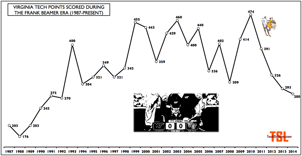
The scoring streak
First things first: the scoring streak is still alive. VT didn’t have much trouble extending it against the Hoos.

Speaking of scoring, VT has one game left to avoid notching their second straight season with less than 300 total points (after 20 straight seasons of 300+ points).
Celebrating the freshmen
Next, let’s ask the freshmen to take a bow … first, an infographic showing that 80.2% of Tech’s skill-position TDs were scored by freshmen Bucky Hodges, Cam Phillips, Isaiah Ford, Marshawn Williams, Shai McKenzie … did I leave anyone out?

Freshman WR Isaiah Ford is having a tremendous season, tied for the fourth-most receptions in a season in Tech history, and remember, he’s got one more game.
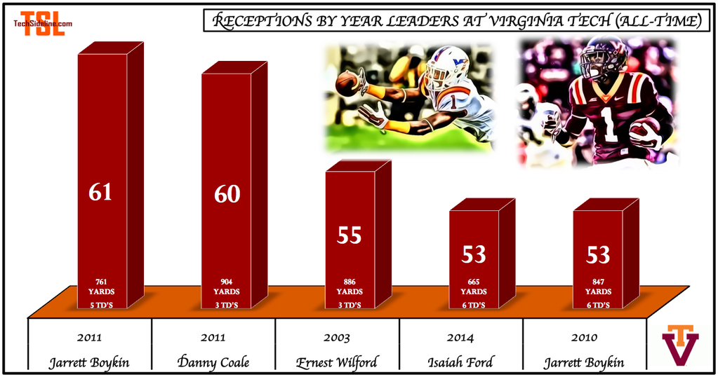
In case you’re wondering … Wilford had 55 catches in 13 games in 2003, Coale had 60 catches in 14 games in 2011, and Boykin had 61 catches in 13 games in 2011.
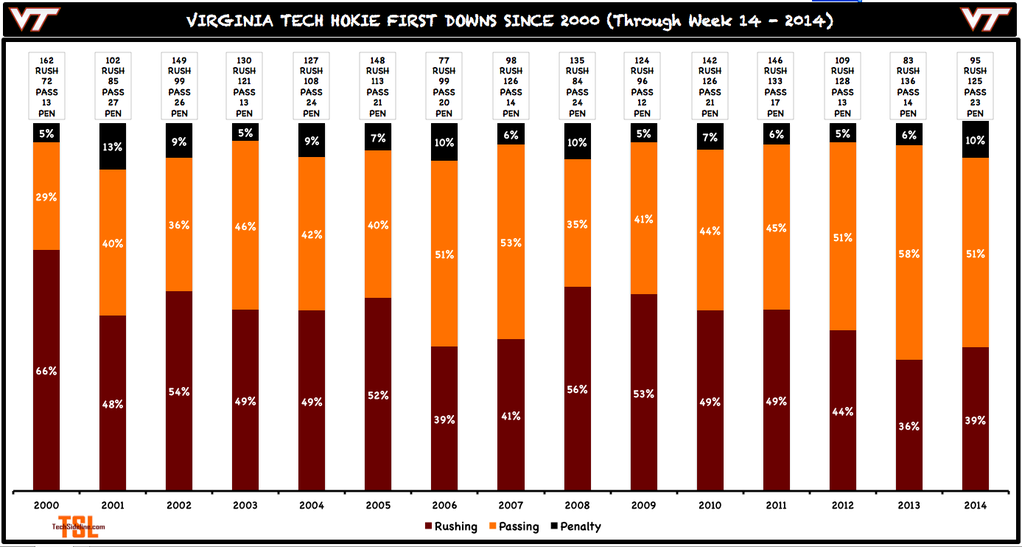
First down breakdown
Here’s the latest breakdown on how many of VT’s first downs come from rushing, passing, and penalties.
Red zone scoring and third down conversions
The 2014 Hokies do two things much better than the 2013 Hokies did: third down conversions and red zone scoring.
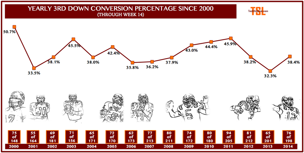
That’s not a *great* third down conversion rate, and it has been in decline since hovering over 50% for the first five games of the season. But at least it’s not as bad as 2013’s low-water mark.
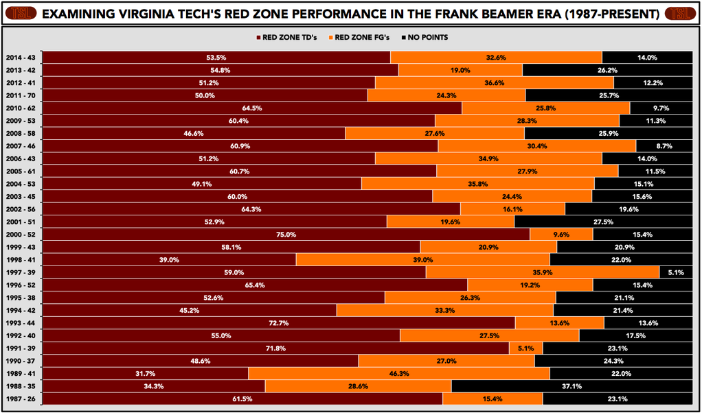
After compiling a third-worst (in the Beamer era) red zone scoring percentage of 73.8% last season, the Hokies have greatly improved, to 86% so far this season. But the TD percentage (53.5%) is only middling.
Last season, the Hokies were 10-16 on field goals inside 40 yards. This year, Joey Slye is 14-of-16. That accounts for almost all of the scoring discrepancy, which is isolated to field goal percentage.
That’s it for today’s update. Tomorrow, we’ll take a look at some team infographics … stats that are a function of offense + defense + special teams.
Many thanks to OXVT for the great infographics all season long! Follow him on Twitter, where he recently went over the (angels singing) 1,000-follower threshold.
 Print
Print


Thanks and hats off to OXVT for the awesome graphics – they have added another dimension to TSL’s content and provide us statistically challenged individuals with a better way to understand what’s going on.
I do have one suggestion on the First Downs Chart: As they appear now, the stats seem to be in a vacuum. It might help to provide some context by also including the number of
“possessions” and number of “three & outs”. This would enable us to visualize how many of these drives were actually sustained by getting the first down.
Terrific feature btw. Makes TSL worth the $$ right there!
Pretty telling that 3rd down efficiency has improved 6% and the number of red zone attempts without points has been cut in half. Coupled with the fact that most points are being scored by freshmen…
If, in fact, SL is gone after this season, I think these graphs show that he has been able to make marginal improvements when. He has healthy, capable players. I see his firing as scape goating and I hate that for him.
In my mind, the scoring streak is over. We were shutout by Wake Forest in regulation.