

It’s clearly obvious at this point that Nike likes to design a lot of different uniforms for their teams. With their ongoing competition with Under Armour, I understand that. It’s also clearly obvious that Virginia Tech is willing to wear pretty much anything Nike wants them to wear.
The Hokies have worn some interesting threads in the past. The all white Nike Pro Combat uniforms in 2009, the all black Nike Pro Combat uniforms in 2010, the camo uniforms last season, orange jerseys, maroon jerseys, maroon helmets, white helmets, black socks, numerous helmet designs….if you can imagine the combination, chances are Virginia Tech has worn it in a football game.
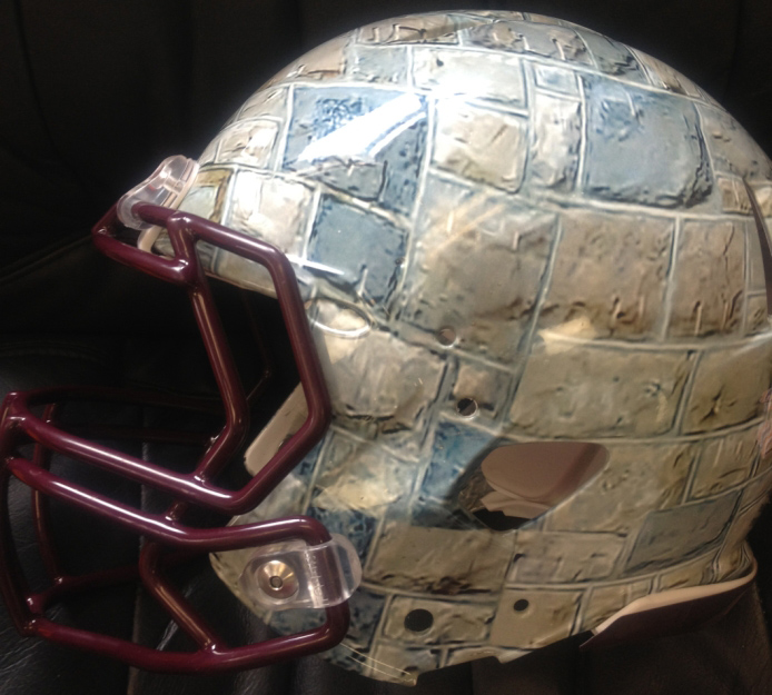
One of the unique things about the Virginia Tech campus is, of course, the Hokie Stone that the buildings are made of. Nike has now taken their uniform designs one step further and created a Hokie Stone helmet. No, it’s not made of Hokie Stone, but it sure does look like it.
I can’t say I hate it. I don’t know what the rest of the uniform is going to look like it. I also can’t say that I like it. I’m completely down with wearing special uniforms…once a year. When you start changing them every week, then they cease to become special. And if you still insist on changing them several times a year, my only request is that they look good. Nike and Tech haven’t always been able to accomplish that.
I was pretty happy the last two weeks when the Hokies wore their regular home uniforms against Western Carolina, and their regular road uniforms against East Carolina. That changes this week, with the latest camo uniforms that feature a helmet that closely resembles a bowling ball I formerly used.
So far, there’s no word on when the Hokie Stone helmets will make their debut. Oh well. At least they don’t look like this…
 Print
Print


UGH, no say it is a bad dream, no a night mare.
Zombie Apocalypse!
Forget the helmet. Let’s put Hokie Stone around the entire field, not just a small part of it!!
I think they will look great with the maroon VT.. Of course, I know the history of Hokie Stone and that plays a roll.
How about our next special uniform be panoramic scenes from around Blacksburg. You could get the Duckpond, Burruss, the stadium, the sunset from the BC game, etc.
Then maybe our jerseys could look like leaves b/c the leave turn orange and maroon in the fall.
Oh yeah and maybe we can add cranes and building equipment to the hokiestone helmets…
When is this crap gonna end?
After the sombrero with the turkey feathers in it.
Don’t forget a photo of the hundred year old trees!
for some reason reminds me of FSU
After the opener with Alabama I thought the receiver’s gloves would have this design.
lol
EPIC POST!!!
Score! (lol)
Whatever happened to just the maroon helmet with the VT?
Whatever happened to the maroon jerseys and white pants for home games and all white for away games?
I hope whenever a new AD is appointed, we put an end to this fashion/clown show.
Amen. We lose our identity every time we wear these “special” uniforms. World’s oldest profession…doing it for money.
PERFECT! This is the most uniquely VT helmet ever. What could be more rugged than Hokie Stone. I absolutely love it!
I actually think it looks awesome! Literally looks like it has a 3D texture to it. Very likely the rest of the uniform will be atrocious but this helmet by itself is very unique, creative, and looks realistic.
Thumbs up from me.
Linoleum helmets? Looks like a bathroom floor covering to me!
And a dirty one at that. UGLY.
All I can say is the current throwback uniforms have worn out their welcome. These Hokie Stone Helmets look unique. Whether they look immature or ugly or just unprofessional doesn’t matter if they look cool in the recruits and players’ eyes. I am all for a new change in uniform.
It looks like a turtle shell. UM
It is like I do not even recognize this team. NO IDENTITY, NO IDENTITY. Maybe the uniform does not change the players, but maybe they do not recognize themselves.
Oregon changes uniforms, but I know who they are, can we say that? I give up. Oregon did it for recognition, and money. Why are we doing it?
You hit on the key point for me. We are losing our identity. That could have very subtle, but real, consequences over time. Wonder when Alabama is going to lose their identity while displaying Nike’s wierd, or mysterious uniform designs?
Worst. Design. Ever!!!!
Sorry – I think that it’s time to re-think our contract with Nike. I can’t believe how ugly those are.
Have fun finding a replacement for the $2MM/year they pay as part of Beamer’s comp package! I can’t see us ever ending that contract as long as Beamer is HC.
Ummmmmm, VT (Weaver) is not stupid. One of the few schools, that breaks even on school sports. Part of show business.
Oh my.
OMB. will VT ever grow up???
Add a Maroon VT on the side of this helmet and it would be money$$! Without the VT, yeah it looks a bit lacking. With a maroon VT, would be an excellent helmet. For those fans not liking the changing looks, players, kids, even coaches love this stuff. So just get over it. My teenage son saw the orange digiflage uniforms we’re wearing this weekend and sent me a text with picture of them saying “Look at VTs new AWESOME uniforms for this weekend!” Relax and have some fun. Oregon’s uniforms didn’t start out being all that and a bag of chips-everyone hated them. Now they are the envy of college football. Have some vision people…
NO
What will the comments be? Especially from TV viewers who have no understanding or appreciation for the tradition of Hokie Stone?
Blockheads. Stoners. Rocky Tops (acknowledging that’s taken by Tennessee). If someone like me can find insulting monikers this easy, what will the really creative types do?
You have traditions and symbols AFTER years of doing the same thing (hence the definition of tradition). You don’t get them by being creative. It’s almost like the kid who tries to give himself a nickname.
I would have hoped the indecisiveness and playing cute with uniforms would have gone at the same time being indecisiveness and playing cute was cut out of the offensive play calling. No such luck.
Good call. 1) If you don’t appreciate the stone-VT connection, then you don’t get it. 2) Maroon VT on side would set it off. 3) Stone numbers on jerseys would go great with the helmet. 4) Oregon goes for interesting change-ups, and I would flat out love to be where they are as a program. 5) I’d love to see the posters below in candid shots of their clothing. Sitting in front of a DNA-drenched computer screen in a salsa-stained teeshirt and camouflage pajama bottoms making proclamations about what’s ugly. Funny stuff.
I like it. I agree thad a maroon vt is needed on the sides.
You guys are hammers. Its a cool helmet. Geez.
I am so sick of the rationale that recruits like these uniform combinations. A) As many have said: you don’t see Alabama pulling these bush-league antics and B) why let the inmates dictate the uniforms?
As long as we win they could wear a helmet with Miley Cyrus’ pic on one side and I wouldn’t give a s**t !
I agree. Just win…Just win.
I’ve seen a lot worse, the Foghorn Leghorn helmet for example. I actually don’t mind the Hokie Stone look, especially if we win when they are worn! Definitely put a maroon VT on it.
I did not care until the turkey track helmet. That was the tipping point. Then it got worse with the Hokie Bird cartoon. Now another cartoon helmet. It’s Fred Flintstone not Hokie Stone. What an insult to our beautiful campus.
Can you see Alabama, Oklahoma, Penn State, Ohio State, Southern Cal, or any of the other quality football teams wearing something that is that ugly?
Why can’t the Athletic Department just “get over it” and let us be Virginia Tech (VT)?
I agree fully, VT and Nike have gone way overboard, and Hokie Stone is just that Stone not football helmets! Our identity is becoming “Oregon Jr”, we change every week! The only constant is change! Identity be damned!
Actually I like the numbers in the above look….just not the chicken with the large talons
It reminds me a bit of the character The Thing from the Fantastic Four.
Chris… unless you have evidence that these are being explicitly designed by Nike, I am not sure its fair to lay any blame (or praise) on them for this look.
From what I understand, Nike doesn’t have any say in the helmets we wear, unless its part of an overall look, such as the Pro-Combat uniform sets of 2009 & 2010. From what I have heard, we work with Riddell for our helmet designs, but most of them, ESPECIALLY the ones over the last year or so, have been done in-house by our own Athletic Department.
Hillary Clinton in a mini-skirt.
There should be no question, The only helmet we should wear is maroon with the white VT. Maybe we need a vote from all Hokies
by far – the ugliest helmet ever. I would rather see the tracks & cartoon Hokie Bird than this
People need to stop buying these helmets at the auction. Maybe that will be a clear enough message to the VTAD. I’m sure most fans would love the opportunity to just buy the standard VT helmets? Ever thought of that? Who wants an orange camo helmet in their house or office?
Pay attention VT football staff. NO ONE likes these ridiculous helmets you guys are putting out there. What kind of dictatorship is it when these awful uniform decisions can be made when there is consistent negative feedback from the fanbase? Stick with color patterns….stop doing these damn hokie birds and tracks, and now hokie stone? Who do we think we are? Are we the only school in the country with this color stone on our buildings? No, we are not. As I stated on the other board, what’s next – a Burruss hall decal or a landscape photo of the duck pond? Give me a freaking break.
Please stick with solid color helmets and our basic VT logo
All Maroon= Blood Clot……………Ugly!!!!!!!!!!!!
The Hokie Stone Helmet is Ugly!
Let me know if you want my opinion on anything else!
Time to switch to adidas
It’s better than the Turkey Tracks and the cartoon character from last year. Wonder if they’re floating this out there to see if people like them? I predict this is the Duke game helmet.
I keep thinking…Fantastic Four…..and The Thing.
Obviously we’ll wear these while playing a neutral site “home game” eight hours away on a Tuesday at noon.
If I didn’t love VT and Hokie Stone I would hate these helmets. As it is, I won’t say anything.
What is this never ending aversion to all maroon? I mean everything maroon including the hats. We looked our best with those combos on and then never wore them again. Hey, why not wear something covered with green grass on it to represent the drill field? ALL MAROON PLEEEEEEEEASE!!
+1
+2
Where do all these “special” uniforms & helmets go? Seems like they’re only worn once…. What a waste…
They get sent to Sierra Leon, Tajikistan, and Bangladesh… and boxes are labeled “Super Bowl Champs.”
Am I the only one more concerned with how the throwback jerseys look? Yes, the foghorn leghorn and turkey tracks helmets were ugly, but with the exception of Nike’s one orange sleeve in ’05 the base jerseys looked much better from ’04 to ’09 than they have since we went all throwback.
At least put a maroon VT on it!
I just threw up in my mouth a little
Normally I’m in favor of all maroon under any circumstances but if we wear it with this helmet we’ll look like FSU.
Oh…my …God. When and where will it end?
Nike noooooo! Stop. Being. Stupid.
Rabble Rabble Rabble! Uniforms! Rabble Rabble! Offense! Bob Dole…
I didn’t get a harumph out of that guy!
http://www.youtube.com/watch?v=JN99jshaQbY
Give the Govenor a harumph!
Normally I hate all the different uniform variations. Using the all black for Boise a few years back as an example, I also hated Nike’s justification for how it “honored” the corps of cadets since black was their color way back when.
But IF we’re going to do these special uniform things, and IF WE’RE NOT going to do them just once a year….then I think I can get behind a hokie stone helmet. It is an identifiable unique feature of the university. At least it makes sense.
That is until they match it with pumpkin orange uniforms or something like that and make it look horrible.
I like it.
I see parallels to Joseph and the coat of many colors … 🙂
Can’t decide if I like it or not. It could look intimidating if they wear all maroon with it.
The worst one had to be the one with the Hokie Bird showing in this article.
It’s not going to look good on TV, even HD. I don’t understand this at all. Please stop with all the helmet and uniform combinations, unless you do something cool like what Nike does with Oregon. Stuff like this just looks like a cheap knockoff.
I like them but the uniforms are going to need to be maroon jerseys with maroon pants to pull it off.
Pull the pants off? What the….hey? Ohhh! I get it..I think
I for one love it, and more importantly I would be surprised if potential recruits didn’t love it.
I like it. But to play devils advocate, potential recruits probably have very little or no appreciation of Hokie stone yet, so they will probably just see it as a helmet with rocks on it.
We have officially jumped the shark
My first reaction was “WHAT THE H”!!!..but…I looked at it again, and depending on what the rest of the uniform looks like…it COULD be pretty cool..
ANYTHING but that AWFUL “turkey tracks” thing which I thought was PATHETIC.
Love it. Marvel super heroes.
hate it….
WHO PAYS FOR ALL THESE UNIFORMS?
Nike.
Then we do, at the online auction.
As much as I like Hokiestone in its many applications, this helmet is one of the ugliest things I’ve ever seen. Don’t care how many dineros Nike flashes…we gotta draw the line somewhere!
It’s another bad design IMO.
Looks a little bit like the turtle shell helmet Maryland had a year or two ago.
I thought the same thing. At least a turtle shell is really kind of round like a helmet, though – this just doesn’t seem like the right place or shape to put the Hokie stone.
Horrible. Will someone in the AD take a chill pill on having 10 different helmets every year?? They just get worse.