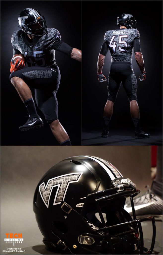
Fans love to argue about specialty uniforms, and Virginia Tech’s got a whopper of a special Battle at Bristol uniform for the September 10th showdown with Tennessee at the Bristol Motor Speedway. Naturally, we’re following up with a Battle at Bristol uniform poll.
Let’s cut right to the chase. Tell us what you think about the uniforms in our TSL poll … here’s a picture showing the complete uniform (photos via the @HokiesFB Twitter feed), and we’ve got a poll embedded after the pics.
Sound off!
Battle at Bristol Uniform Poll
Now’s your chance … what do you think?
Editor’s Note: the poll should appear below, but some users are reporting that they can’t see it or vote in it. This is the first poll we have run under our new site format, so apparently, we have some issues with it. We’ll work on it.
Thanks for weighing in!


 Print
Print


From VT Admissions:
“The original colors, black and cadet gray, were adopted in 1892, but they were discarded because people felt they were suggestive of a prison uniform when worn in stripes.
The new colors, officially known as “Chicago maroon” and “burnt orange,” are unique to Virginia Tech and were first worn in a football game against Roanoke College in October 1896.”
Maybe now since prison uniforms are burnt orange we will change back? (tongue in cheek)
What happened to the color Orange ?
Oh wait ………. I see Orange on the hands!
Well, that SORT-OF harkens back to turkey feet.
Really BAD choice of Uniforms for a game that will be the largest attended college EVER.
I couldn’t vote on the poll but I’ll say now that they are horrible but I don’t like any “special” uniforms. Let’s stick with the old tried and true maroon pants and white jersey and PLEASE no more all orange!!!!.
While UT has recently announced they will wear their traditional home uniforms (orange jerseys and white pants), Rocky Top Talk (SBNation) says that “Virginia Tech, conversely, will be wearing what appears to be uniforms made of reconstituted newspaper/historic maps of Paris/wall textures from Wolfenstein”. I had to chuckle.
Makes me want to cry…I already have the Hokie Blues over these uniforms.
I just spoke with Lester and he said that if he was dead he would be most assuredly “rolling over in his grave.”
Would somebody let me know the results of the poll? I can neither vote or review results.
Also does anybody else have my additional problem that I read an article, then click on the next article down and I’m sent to a log in page from which I can not escape without going completely out of the website? Very frustrating!
The university of Alabama campus is dominated by brick buildings. What are the chances that the Tide will be wearing some brick patterned unis this year?
We are the victims of Nike’s myopic graphic designers who view everything as art … and closeup!!! When these unis are viewed from a distance (TV and stands), the Hokiestone motif will be TOTALLY LOST. Those portions of the uniform will just show up as patches of gray. Need new designers. Blah and blah.
a great big huge YUK
I agree…when we get beat by 14 to 21 just becomes a joke.
Key recruiting tool these days. All the gangs support black uniforms – it’s why every program now has a black alternative.
Not hard to vote on this uniform. I like the O & M much better.
Harrumph! I don’t like change.
I totally support Coach Fuente and his staff. However, Our school colors are Maroon and Orange with the white trim. Would like to see Coach Fuente move to a different look from the current Unis with his own style that separates and introduces a new era of VT football after this version is worn in the “Battle of Bristol” game.
“GO HOKIES”
Voting didn’t work for me, I’m viewing it on an iPhone 6S on Safari
I totally concur with VTMAN and Hokieglenn above. What in the world were the powers to be at VT thinking when they came up with this horrid uniform combination? Bet you a dollar to a donut that you wouldn’t be seeing traditional football powers going with this garbage if they were in our position. FYI Whit, it’s only the biggest stage that VT has played on since the NC game and no one will even now who we are until one of the announcers says “the Va. Tech Hokies.” Really poor marketing.
agree
agree even more
FAIL
if the recruits like them, then i like them!
The Raider Nation will be Loud and Proud vs the Vols. I wonder if Tennesee decided to forgo the color Orange.
No but Tech did ………
Nice poll – can’t vote or view results.
But I hate the unis… Boise State deja vu. Maroon would have been the obvious choice.
Photos of this Historic game will be around for generations…..and we’ll be in black/gray camo.
Believe helmet should have been maroon with the VT logo in hokie stone maybe w some orange trim around it. The helmets are what really stand out on tv anyway.
I always prefer that Virginia Tech wear a traditional Virginia Tech Uniform – to establish & reinforce the image of VT. All of the uniform changes made recently takes away from the official image depicting the Virginia Tech Hokies. Who knows what our image is these days.
Thus, I HATE THE RACEWAY UNIFORMS
The play on the field is the image of the Hokies, not the uniform.
Unfortunately over the past four years VT’s image on the field is 29-23. ouch. Maybe the fancy uniforms will keep some people from noticing the record.
Since we are doing away with all Virginia Tech Colors and logos why don’t we wear the colors of the opposing team we are playing. Liberty would be shocked to see us come out in their colors as well as UNC, Miami and UVA. Hokies in Carolina Blue now that would do it. Talk about a gimmick uniform to get us noticed. *Note to uniform designers this is sarcasm do not put Hokies in UVA or WVU colors ever!
Outside the domain of being uniforms specific to VT I really like the design and thought put into making them unique. However, for representing Virginia Tech in literally the biggest game in NCAA football history, it is just terrible how neither of our primary colors are utilized in any major way.
If Whit is 100% behind the design then he might as well go ahead and make black a primary school color.
I really like them. I do wish they didn’t skew the hokie stone pattern on the back and I’d love to see some pop with some orange or maroon accents. Overall though very nice.
I really don’t care as long as we play well in the game. I like these more than the hokiestone helmets from a couple of years ago. My favorite alternate uniform was the all white pro combat we wore probably 5 years ago or so.
Traditionalist here. Would rather see us, in the largest attended college, with our traditional O&M uniforms. Don’t understand why our school colors keep getting messed with.
Not bad… kinda like em. I think Hokie Stone is a part of the Virginia Tech brand, just as much as maroon and orange and the squareroot of one. I have personal preferences, mainly for maroon (orange should only be used as an accent), but the black is neat change-up. Where I go completely bananas is when they start effin’ with the helmet logo. That SQRT(1) logo needs to be the one constant on our uniforms. No Hokie Bird, no turkey tracks, no Pylons.
If you want a throwback uni, then do the whole throwback (pants-jerseys-helmets) to an earlier time. I wouldn’t mind doing that to the T-in-V logo helmet. Older guys, help me out… didn’t we once have a helmet logo with the Fighting Gobbler silhouette? That would be cool. We don’t need to bring back the TECH helmets with the outline of Virginia… those were hideous, IMHO.
Anyway, the point I’m driving at is our University has spent a lot of time, energy and money developing a brand identity and every time Nike brings out a novelty helmet, they eff up our brand recognition. That just needs to stop. We have decided to go with the SQRT(1) logo, so let’s stick with it already.
I don’t mind Hokie Stone as a brand (it IS unique to us) but it needs to be balanced with traditional maroon + orange.
I agree on the Hokie Stone brand. And I love our maroon and orange accent. But I don’t really have a problem with black and gray as that is truly a throwback for us. Well, not us so much as our great-great-great grandparents. Those were the colors for VAMC before it came to be known as VPI.
Don’t care what uniform they wear as long as they beat the Vols!
I’m in the “I kinda like them” camp, but I would have preferred to showcase a traditional uni for this game. Tennessee will trot out in their classic whites I’m sure, which IMO are right up there with the Bamas, Michgans, and USCs of the world. UT hasn’t been on that level in years, but they still ACT like it. No reason we shouldn’t act like it as well.
I will say that these are miles better than the black unis we wore for the BSU disaster. That had to be foreshadowing. One thing that I think could have put it over the top and would’ve looked sharp is making the VT on the helmet maroon. Show we haven’t completely forgotten what our colors are…
totally agree with King Jaffe. well said.
Everyone keeps saying the kids “love them”. If thats the case, how come our recruiting fell off so far immediately following the Boise State game??Kids seem to be loving FSU and Clemson, who rarely change their unis…..and both of which were behind VT from about 2005-2010
Kids DO love these uniforms. Can you find even one quote from a player or prospective player that disapproves of these uniforms? I doubt it. But don’t overemphasize the impact that a uniform can have on a recruit. A much bigger factor upon the success of recruiting is the personnel, not the materiel. Recruiting problems resulted from the often cited problems with the recruiters themselves. With the new staff and new recruiters, things are progressing again.
Lack of disapproval “they love them.”
As a former player I can tell you these kids rarely have the time to give a crap what the uniforms look like, much less comment about them the way we do. They’ve got more important things to think and worry about. I doubt the uniforms have anywhere NEAR as much effect on recruiting as folks keep going on about. For recruits, it’s about their relationship with their prospective coaches, how well they fit into that coach’s system, how quickly can they get playing time (or will they be rushed onto the field before they’re ready). It’s about the school, the people who go there, how easily can mom and dad come to see them play… things like that. The uniforms are pretty frickin’ LOW on their list of concerns, if they’re a concern AT ALL.
Should read “Lack of disapproval ≠ “they love them.”” Stupid html protocol.
My point remains. You can find plenty of comments from players and prospective players stating that they love the uniforms. I challenge you to find one quote from a player or recruit who doesn’t like the uniforms.
Go on twitter and see what they kids are saying. Because you were a former doesn’t mean you understand today’s players.
Please find one quote of any recruit in the nation for any school that says “Well, I’m signing there because of the cool uniforms.” Or, even a quote with the uniforms mentioned on signing day.
Thanks,
Did you read my post? For the sake of clarity, I direct you to this portion: “But don’t overemphasize the impact that a uniform can have on a recruit. A much bigger factor upon the success of recruiting is the personnel, not the materiel.”
can’t get to see results or vote.
same
This is the first poll we have run under the new site format, and apparently, it is not fully functional. We’ll work on it. Sorry for the trouble.
all I can see is results: denied voting op
All the talk from the administration about standardization of the “brand”, and the first major exposure opportunity they have to highlight it they go off the rails….ridiculous.
absolutely. Charles Barkley has it right…..”Turrible”
You nailed it. Talking out of both sides of the mouth.
Dope! And the recruits on twitter are really digging them, so that’s two thumbs up!
Thats Urban Legend. Check out AP Top 10: everyone wears pretty much the same uni they’ve always worn. If you want to be a champ at least try to look like one
1 Alabama(33) 0-0 1469 —
2 Clemson(16) 0-0 1443 —
3 Oklahoma(4) 0-0 1352 —
4 Florida State(5) 0-0 1325 —
5 LSU(1) 0-0 1269 —
6 Ohio State(1) 0-0 1224 —
7 Michigan(1) 0-0 1147 —
8 Stanford 0-0 1029 —
9 Tennessee 0-0 1021 —
10 Notre Dame
Agree
Of course people are going to “love” the new uniform, and there is value in them. However, there is MORE value in having a classic, consistent look, that everyone recognizes and identifies with a school. Everything else is just a distraction and not really a recruiting tool.
Go Hokies
Good observation Bugle 76…..looks like gimmick uniforms are for middle of the pack and lower teams.
exactly
The thing I like most about them is we put it on the #1 player in the state and (one of) our biggest recruiting target(s) to debut them.
To me, looks like a tile job gone wrong. Or that gray-scale stuff from The Game of Thrones.
50 Shades of … nahhh!
I will always prefer seeing O&M as the predominant colors but for a special event like this, I think these are pretty cool.
Biggest attended college football game ever, primetime slot….and we choose an uniform that is totally unrecognizable to our brand.
No maroon at all. Stupid.
100% spot on
+1
nail head hits hammer in center of its face
not a trace of Chicago maroon, I can see.
i hear there’s some orange outline somewhere:
in Bristol’s distant grandstands you’ll never see it.
a very missed opportunity to display the O&M brand nation-wide
Exactly.
agree- should have been a polling option:
Like, but would prefer having some sort of O and/or M in the uniform.
I agree with EddieVT, I need to see them in action, so I voted neutral.
I like the overall look. Not sure how I feel about the digi-camo nature of the hokiestone though.
Depends if we win
I need to see them on TV to really decide, but I selected “Not bad…”