

So now that you’ve been using this new site for four days, isn’t it time we made a formal introduction?
Sorry for throwing you into the water without much explanation or warning on Friday, but we were scrambling up to the end to get the new site ready before the Bama game, and we launched it in a rush.
We won’t babble on and on, but instead will give you a quick rundown of the features of this new site:
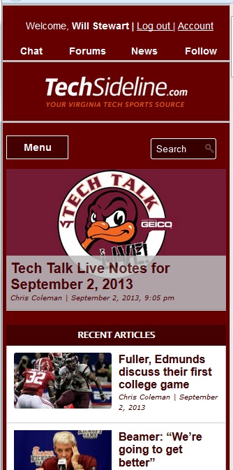
1.) More mobile-friendly: This site uses a technique called Responsive Web Design (RWD), which is a programming method of changing the way the site displays itself on different-sized devices.
As the display window shrinks down from desktop size to laptop size to tablet to smart phone, the various elements of the site move around, appear and disappear, and realign themselves. Try it: if you’re reading this on a desktop or laptop display, grab the corner of your browser and resize the browser, and watch the site shift around.
We have needed a more mobile-friendly display for a long time now, and we’ve finally got it. Enjoy the site on your tablet and smart phone just as much as you enjoy it on a desktop.
2.) Simplified presentation: Tabbed displays and home page slide shows are a thing of the past. Everything’s right in front of you; no figuring out where stuff is, or where it went.
3.) Re-introduction of the old-style threaded boards, and reformatting of the vBulletin boards: Yes, after a year and a half without our old-style boards, we have dusted them off, updated them, and brought them back to life. Just look for “Chat Boards” in the menu to check them out.
We also stripped out all the threaded elements of the vBulletin forums, turning them into true topic/linear forums, as their designers intended them to be. vBulletin is at its best in this format. Look for “vBulletin Forums” in the menu to check them out.
For more on the boards, see our Board System FAQ.
4.) New, automated “Hokie News” feed: We love this feature. Instead of manually updating Hokie News each morning, we now have a Hokie News feed that brings you VT sports articles from around the web automatically, all day long.
We have embedded the feed on our home page, and in the sidebar of articles and pages. You can also access it as a full-size page by clicking “News and Features — Hokie News” on your desktop/tablet or “News” in the header of your smart phone display.
See it by clicking here. Learn how it works, and what feeds are included, by clicking here.
5.) Improved RSS feed and site search functionality: Long story why, but our previous site couldn’t provide a good RSS feed or site search. This one does. Check out the main site RSS feed by clicking the RSS icon in the header, and use the search function in the header to search articles and pages (but not chat boards or vBulletin forums).
That’s about it … things went pretty well over the weekend with the new site, although we’re still trying to iron out some login issues and various bugs. Just let us know on the boards if you have any questions, and email us if there are any major issues with the site.
 Print
Print


I read TSL for content. Design is okay with me as long as it works. The redesign is great . . . except for some reason: TSL posts by you and Chris have a maroon background. Since I read several pages of content every day, I like to copy and paste your posts and read them at my leisure. I cannot do that by printing white text on a maroon background. Sure, I can print each of your TSL posts separately from your “Printer Friendly” link, but those include space-consuming pictures, 1.6 line spacing, and large fonts, wasting space and pages of paper. I don’t need the pictures. I check out pictures before I copy and paste, then cut all photos from my prints. Is the background necessary in the new format? If it is difficult or time-consuming to change, I’ll live with it and stop bringing it up. If it’s a simple fix, I wish you’d make news and stories posts black text on white background again.
Thanks, Will.
Would like to see the Women’s Basketball Board link in the Chat Board drop down. Thanks.
A few comments about the new look and some older stuff.
The site looks sharp on my iPad. Are there any plans to come up with a TSL app? If there already is one, I’ll just sit over here in the corner in shame for awhile.
What’s the deal with the new HTML address? Again, if it has already been like this for awhile and I didn’t pay attention, you can see me in the corner.
Biggest beef – I have to login every time I access TSL. Is this an intentional change? The login used to include a box to check stating that you want to remain logged in for awhile, which was usually hit and miss before the change. Now every time I access TSL I’m logged out, even when I keep the page up on my iPad or desktop.
Finally, are we done with change for awhile? I’m much more interested in your content than your delivery system. And I mean that as a compliment. TSL is the ONLY website that I pay for a subscription. I can’t imagine a Hokie football season without TSL.
App? No, because the responsive design shows well on a phone, and programming an app would cost extra $$$.
New address? Long story, but a big part of the new architecture is that it’s now on a networked system where we can add other sites, like gt.sportswar.com, bc.sportswar.com, etc.
Not sure why the repeated logins are occurring — that’s very annoying.
Done with change for a while. I’m worn out, and we’re out of money to pay a programmer.
It seems you are still using third party cookies. I bought an M&M’s tee shirt on line two years ago and I still get their ads on this site. There was one at the end of this story.
Very cool Will. I didn’t access TSL much from my phone before (Android), but I really like this and will do so much more in the future!!! Very well done IMO
Great job on the redesign. I love the Hokie News feed and love the return of the “chat” message board format even more. But most of all, the mobile-friendly features are such a welcome addition. I’ve been reading TSL on my Kindle Fire for nearly two years and as of Friday it became oh so much easier to do that.
Love the new redesign. Works great on an iPhone. BTW, did we lose the journal entries…IE the bourbonstreet sidebar?
First impression is generally good, particularly for my mobile phone. One thing that sticks out is the size of the font seems to be smaller, and a double tap on my iPad makes it too big to fit the screen. Otherwise, appreciate the refresh.
Was looking forward to better iPhone access to the entire site, but since the upgrade all I get is an error message on Tapatalk: “Cannot connect to forum”, “This forum is either restricting access from Tapatalk or the installed Tapatalk plugin is not working. Please contact your forum administrator.”
This is still true as of right now.
Might be helpful to know: I changed my password on tech sideline about a week before the change over and have not been able to setup an id under tapatalk with the new password. Keep getting System Message of
“Account doesn’t exist, please try again”.
Been around since ’94 (or was it ’95, ’96?) . . . anyway, it was AOL dial-up. This reconfigure is great. Corrects the issues that, for me, made the 2012 Sugar Bowl update painful.
Like the new look and features very much. Content seems upgraded as well. Excellent job!
Love the new site. Functionality is great and thank god that awful picture of the woman peeling her face off isn’t the first thing I see when I log in. Please don’t ever let that come back.
Sorry, but that ad is still there …
One thing I’ve noticed and never asked/commented about before: why do the messages and posts below a story all get logged in reverse order? (newest first) Did I miss a setting or something? Sometimes I’ll read a comment and need to scroll further down to see what the original comment was.
The reasoning behind that is it enables you to see the most recent comments first. If you are revisiting the article after having read it once before, you don’t need to keep scrolling, and scrolling, and scrolling to get past comments you’ve already read. The most recent ones are right at the top.
We paginate comments every 50 comments, so in instances where more than 50 comments (or more than 100 are logged), you don’t have to go to pages 2 and 3 to see the most recent comments — they’re right at the bottom of the article.
That’s the reasoning — SHOULD it be done that way? Do other web sites do it that way? I’ve seen some that do, and some that don’t. I’m not sure what convention is, to be honest.
I think your reasoning is solid. With the most recent post first, you often get the answer or guru comment on a issue right away instead of having to scroll thru the entire thread.
So far so good. The new Hokie News feed is great. Very comprehensive. Mobile format is a huge improvement.